Case StudyWEB DESIGN · User Experience
Tuscany Web Theme
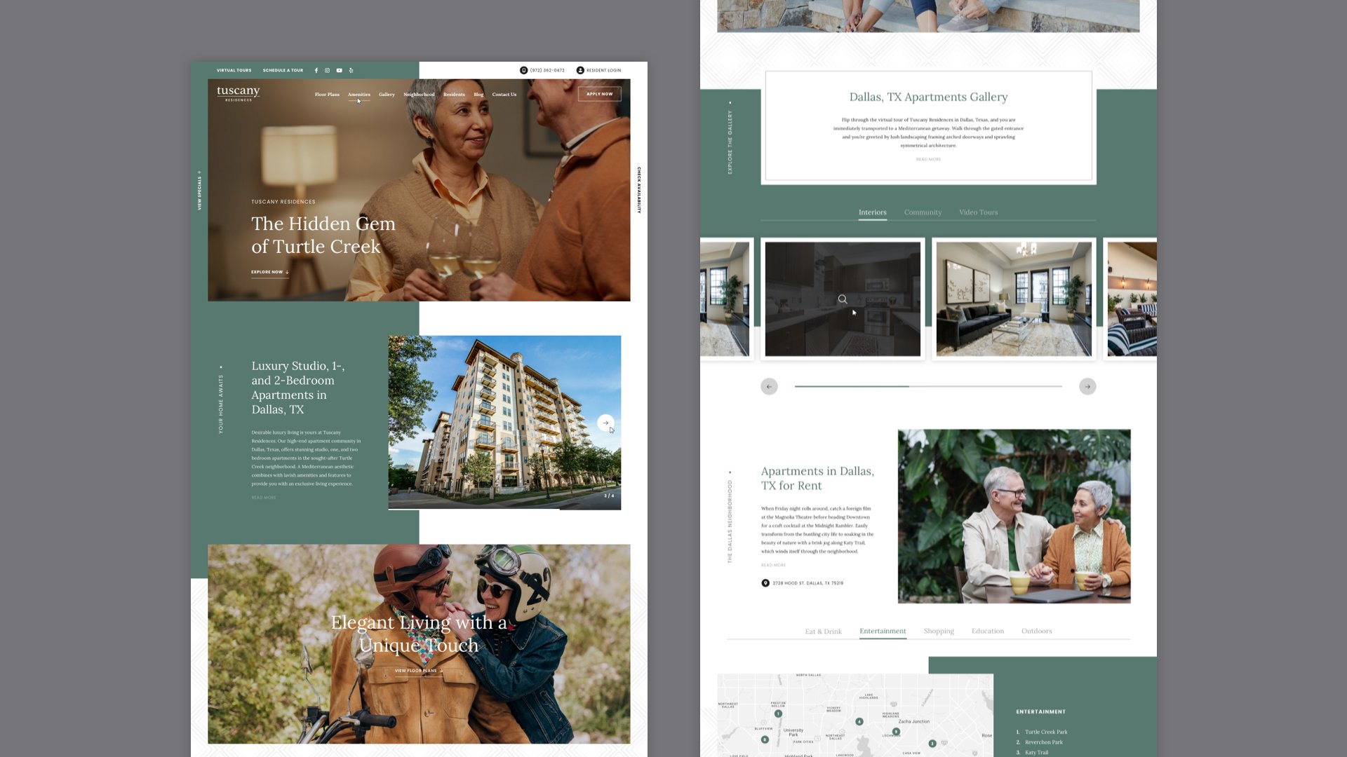
Tuscany is a custom web theme I designed for Lincoln Property Company, one of America's largest real estate companies with over 212,000 multifamily units managed nationwide.
Overview
At LeaseLabs, I design custom websites and themes for companies like LPC and their massive portfolio of residential properties. LPC needed a new, proprietary website theme designed specifically for their mid-rise apartments. Following LeaseLab’s Scrolling Page Architecture single-page website format, I was tasked with creating a responsive theme where colors and typefaces can be easily changed within LeaseLab’s CMS for different properties.
Client
Role
Web Designer for LeaseLabs by RealPage
Project Scope
Web Design, Product Design, Responsive Design, Interaction Design, UI, Visual Design, User Experience: Wireframing, User Personas
Tools
Sketch, InVision + Craft
Goals & Objectives
Working with the project management team, our first task involved defining LPC’s business goals as well as user goals for their current and prospective residents.
Design a modern, versatile website theme for mid-rise properties that’s scalable across multiple breakpoints.
Design around the theme’s ability to have its colors and typefaces (provide options) globally changed in the CMS.
Make the website easy for users to browse floor plans, amenities, neighborhood map, media, apply online, and access their resident portal all on one page.

Primary Demographic
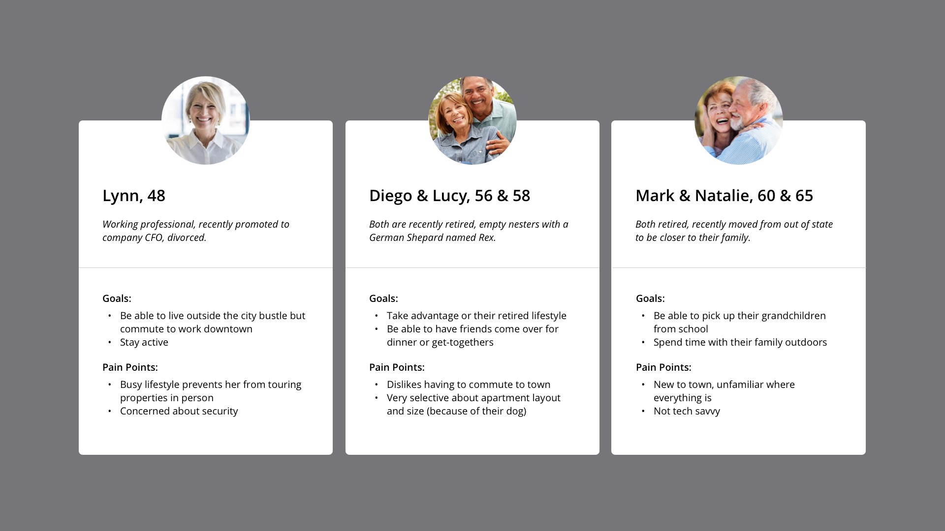
Because this is a website theme, demographics could be varied depending on the property using it. However, because the client wanted to target mid-rise properties (opposed to high-end luxury), we were able to deduce that these prospective renters would range from 30 to 60 years old based on the demographic of their existing mid-rise properties.
Using one of their current Dallas properties as a starting reference, we created 3 user personas and identified some of their possible goals and pain points:
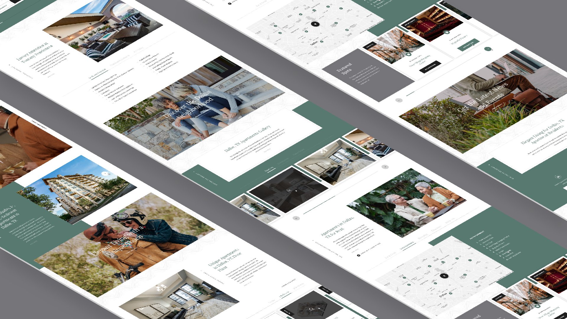
Wireframes
Following LeaseLab’s single-page scrolling format, I began with low-fidelity wireframes that outlined each section of the single-page website to create an overview of the user’s journey as they scroll.
I made sure to be strategic with mapping out the interface, designing each section to flow into the next, and avoiding crowding sections where content could get lengthy. Headings that lead into each section had to be clear and recognizable.


Designing for Mobile
Condensing a single page website into one fluid, navigable experience on mobile is challenging, especially considering the amount of leasing content that users may have to scroll through to find what they’re searching for.
Some solutions included condensing lengthy, vertical content (such as POI lists) into dropdown accordions, making carousel cards draggable, and hiding long bodies of text behind a “Read More” button. Having a standard 12-column desktop grid to follow helped me translate and organize these elements out neatly on a mobile 4-column grid.


Micro-interactions
I used simple micro-interactions hoping to engage users and encourage them to perform an action to access more content and information.
For Tuscany, I included interactions like: timer progress bars on image carousels to show that there are more images coming into view, hover states with icons for thumbnails that help inform users if the content is a photo or a video, and tabs that dynamically load new points of interest on the map according to the category clicked.


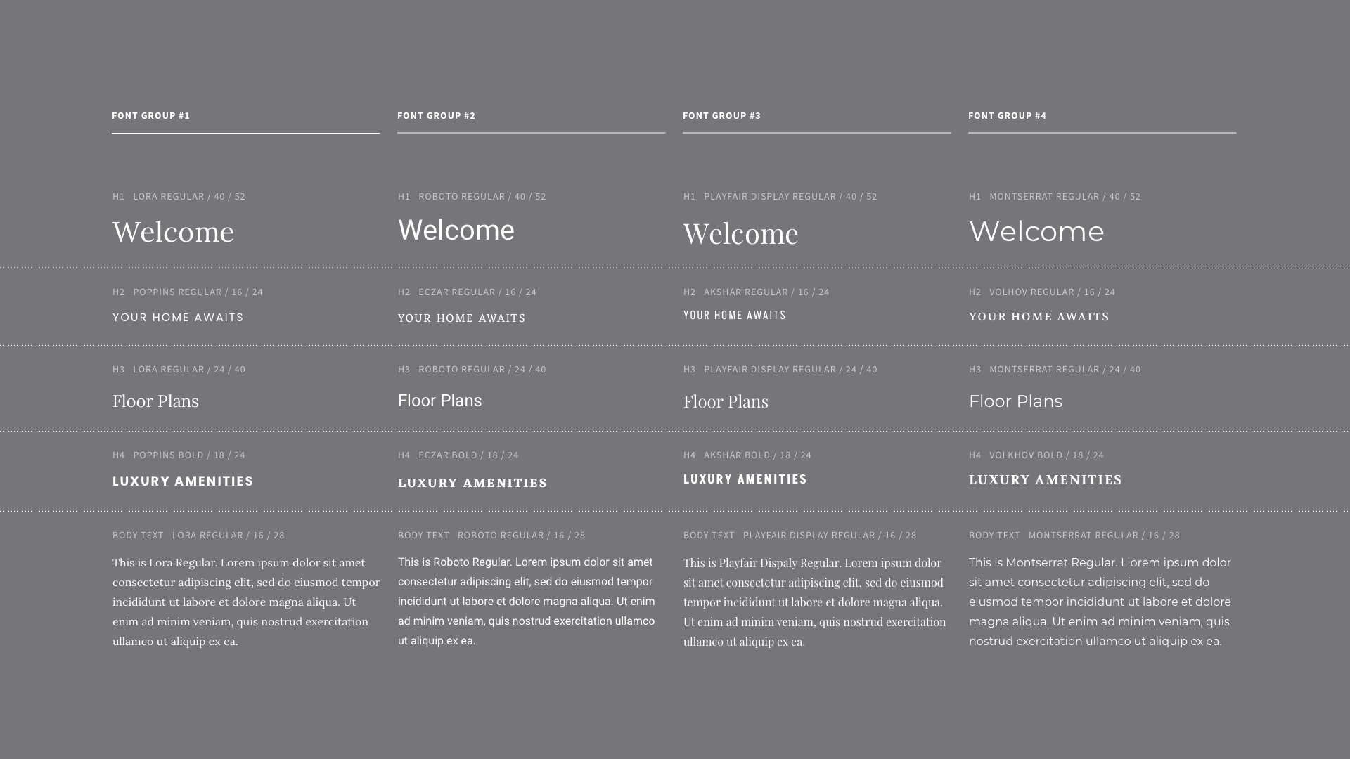
CMS Theme Elements
Because this is a theme, primary and secondary global colors used throughout the website needed to be changeable for the client in our CMS. Keeping this in mind was important since changing colors could effect visibility for certain elements.
I was also tasked to provide alternative web typeface pairings options (4). By lessening the number of choices the client would have to choose from, refitting the theme for multiple properties would be a quicker task, and it would prevent them from using typefaces that aren’t appropriate.
To communicate these features with our engineers, I included a simple design system sheet showing what typefaces the headings and body text would change to and their font properties.

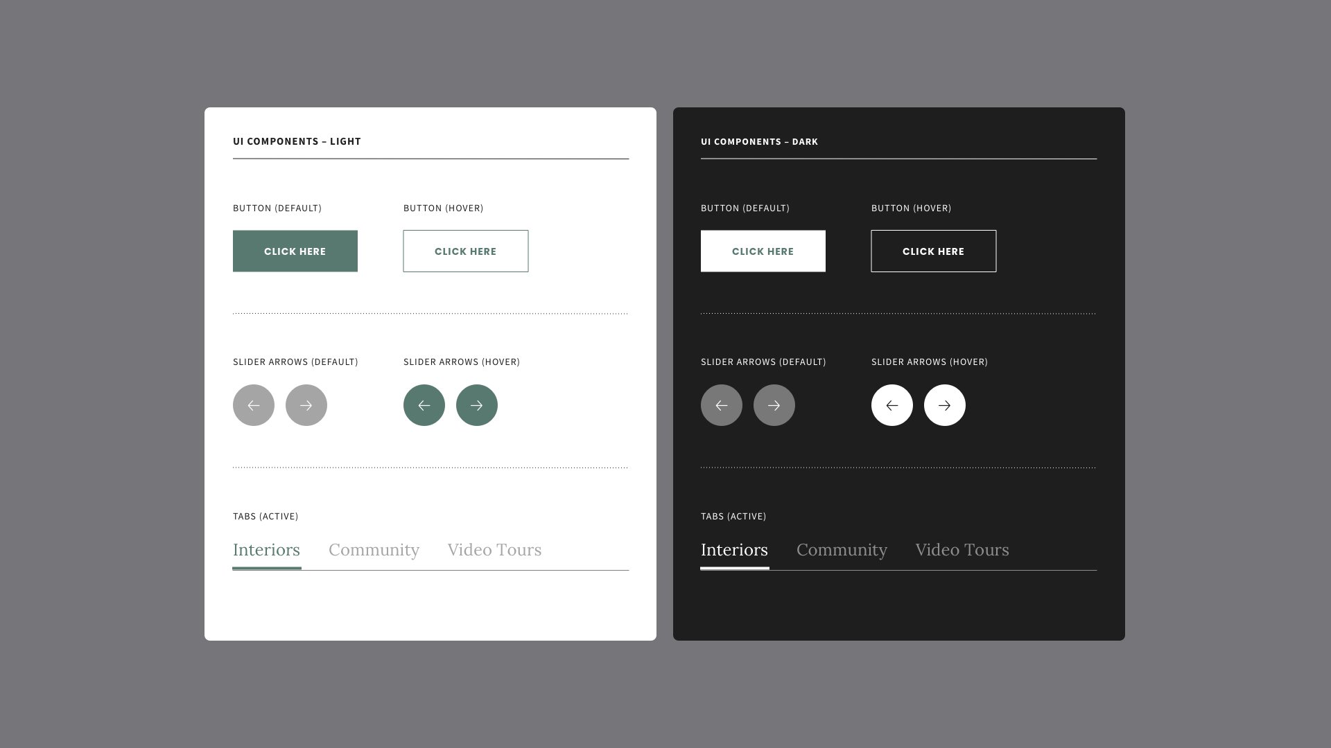
UI Components
Establishing a design system for the interactive UI components of the website was important because of the websites ability to have its color changed by the client, especially if these elements lived on both light and dark backgrounds.
Final Product
Once the website (desktop to mobile), was reviewed by our QA team, we were able to create a staging link for the client to also review. It was critical to collect feedback from the client once they were finally able to interact with the website because of last minute additions and requests that could have affected the website experience when launched.