Case StudyUX Design · UI Design
Huddle App
Huddle is a mobile app designed to make group travel planning easier. Users can invite friends to collaborate and plan their trip itinerary together in one shared place.
Overview
Huddle is a second iteration and reimagining of a fictional app I designed in 2018 called Planr. To expand and improve on the original idea, I conducted new interviews, cataloged new insights, and tested new ideas to design a more robust and collaborative app.
Role
UX/UI Designer, Personal Project
Project Scope
Research: Competitor Analysis, User Research, Ideation: User Persona, User Journey Map, User Flows, Design: Wireframing, Visual Design, Testing/Iteration: Prototype, Usability Testing
Tools
Figma

Problem
Travel planning with a group can be a daunting task.
Especially with big groups, plans can get lost in lengthy messages, trip notes can get scattered across multiple apps, and group expense tracking can get confusing.
But it hasn’t stopped people from traveling. With TikTok, influencer culture, and the rise of music festivals in a post-pandemic world, more people are traveling.
In 2022, American travelers spent an average of 29% more time booking a trip than in 2019 (TripAdvisor). With so much traveling, how could we make the planning process efficient and engaging for users?

Problem Statement
People traveling in groups need an easier way to plan their trips because information can get lost in messages or scattered across different apps.
Competitor Analysis
Users need more access to app tools to efficiently collaborate.
I looked at 4 different itinerary planning apps from the App Store marketplace: Wanderlog and Tripsy (the top 2 rated) and emerging/indirect competitor apps called Troupe and The Bach (a bachelorette party planning app).
Tripsy requires a costly subscription to use all its collaboration tools despite having great iOS compatibility. Troupe, while collaborative, is limited and lacks efficiency. The Bach does well in what it advertises, including polling and group messaging, but is specific to party-planning use. Wanderlog stands out with intuitive tools but is also slightly hindered by paid features.
At their core, all are decent at itinerary-building, but for the casual group traveler, are the extra features worth the money?
Iteration Anaylis
Improving on Planr.
Planr was my first iteration of a group travel planning app in 2018. After testing the prototype again, it was clear that it needed improvement.
Its main issue is in its limited, linear flow. After entering a destination/date, users must use the search feature to add activities. There's no option for manual input or to skip and add later. After naming/saving their trip, users can only invite friends or vote. There are no further options to add notes, flights, lodging, etc.
I realized I didn't include a trip home screen where these details would live. The prototype showed the clunky steps to start a trip but not enough of how users can see and access this information with their group.

User Research
Lack of engagement and conflicting interests make planning frustrating.
To better understand the pain points of users, I interviewed six people in person (ages 22-34) who had experience traveling with a group. I had them all recount their most notable or recent trip-planning experiences.
Interestingly, four of the participants said they were flexible with their planning, but that was to avoid making final calls for people with different interests and due to a general lack of response from others in the group.
These insights were distilled into theme groups using an affinity map that helped me revise my problem statement.
“When there’s people [in the group] I don’t know personally, I feel like I can’t really choose to do the things I wanna do…”
– Ana
“I like traveling with people who can be fluid because plans might change unexpectedly.”
– Sergio
“I was chasing people down to get their Venmo to pay me back for stuff.”
– Lyn

Revised Problem Statement
People traveling in groups need a better way to engage with each other to plan their trips more effectively and efficiently.
User Persona
Victoria, the habitual and organized travel planner.
Using data from my research and interviews, I created a user persona named Victoria. Victoria is a young professional who travels often and has a lot of experience planning trips with her friends.
This year, she's planning a trip to Hawaii with the largest group she's ever traveled with – some of whom she doesn't know very well. She wants to plan an enjoyable trip but has to consider the group's interests, budget, and comfort levels.
User Journey Map
Mapping the user journey and identifying opportunities.
Combining data from my interviews and the scenario from my persona, I mapped out a typical user journey for planning a group trip. This helped me identify where user frustrations where occurring and possible solution opportunities I could solve with Huddle and integrate into my flow.
One opportunity I wanted to explore was to have Huddle generate suggestions for places/activities based on common interests with users in the group.
User Flow
Using Huddle to add, collaborate, and plan a group trip.
Planning a trip can involve many scenarios, so I only wanted to demonstrate a few essential tasks in my user flow. That way, I could focus on creating a simple flow to test a minimum viable product without getting too complex. I segmented these tasks into:
Create an Account
Add a Trip (Start + Join)
Add to Trip (Flight/Place/Poll/Expense)
To help users plan more collaboratively, I planned to implement a feature where users input their interests when they create their accounts. They would be displayed on users' public profiles and used to smart-suggest places/activities between users with similar interests.
Adding a trip: Planr vs. Huddle
Refining Planr's flow for adding a trip was important because it was too linear and lacked flexibility. By making users add activities before they can save their trip, users are forced to make decisions too early on.
With Huddle, users are taken directly to the trip home screen after setting up their trip and opting to invite people. From there, users can decide what to do (or add) next at their leisure.
Planr Vs. Huddle
“With Planr – by making users add activities before they can save their trip, users are forced to make decisions too early on.”
Lo-Fidelity Sketches
Putting ideas on paper.
Huddle's flow required more screens compared to Planr. I sketched wireframe screens for the sign-up process, including a screen where users could add their interests.
With the dashboard and trip home screen, I wanted to use ideas from the best UI aspects of Wanderlog, Tripsy, and Troupe. The goal was to have a UI that's easy to navigate so users could access trip information quickly and easily without getting overwhelmed.
Mid-Fidelity Wireframes
Taking sketches to screen.
Using Figma, I converted my best sketch concepts into mid-fi digital wireframes. Huddle's UI would house a bunch of information, so I carefully determined the hierarchy between elements for seamless app navigation.
Unlike Wanderlog, I chose to have trip details like flights, notes, and lodging live on separate screens when opened instead of expanding on the home screen to avoid information overload. For the "Add to Trip" menu, I leaned into Tripsy's simple, widget-like UI so users can make quicker decisions at a glance.
Usability Test #1
Users had trouble finding buttons to add a trip and to add to their trip.
I prepared the wireframes into a prototype to conduct usability tests with three users with tasks to: create an account, add a trip (start + join), and add to their trip.
Huddle was well received, but users noted struggling to locate the add a trip button on the empty dashboard. As a solution, I included a one-time action suggestion near the button (after users create an account). Similarly, users didn't realize they could add to their trip with the bottom menu button on the trip home screen. To fix this, I centered and relabeled the button to read "Add to Trip" (instead of an icon) to make it more obvious.
A second usability test with new users validated that the button changes made it quicker to complete their tasks.
“It took me a second to figure out where I would add [or join ] a trip.”
“I thought I had to add things [to my trip] under each section. I didn’t realize this menu was here.”
Visual Design
Branding Huddle.
Designing Huddle's logomark, I combined the location mark symbol and a comment bubble shape to convey travel and (group) conversation. I picked primarily (Pine) green because it embodies energy, harmony, and productivity. Sky, sediment, and ruby are used as accent colors. In unison, all colors pass WCAG web accessibility standards. For readability and clarity, I selected sans-serif fonts.

Components & Patterns
Creating a cohesive UI ecosystem.
Having reusable design patterns throughout Huddle was important for creating consistency and familiarity. I made granular components (buttons, tabs, etc.) that, paired together, created larger patterns like drawer menus, tabs, cards, and modules.
When combined with color, these elements help users navigate Huddle. For example, Pine is used for action buttons and grayed-out text indicates user fields for users to input information.
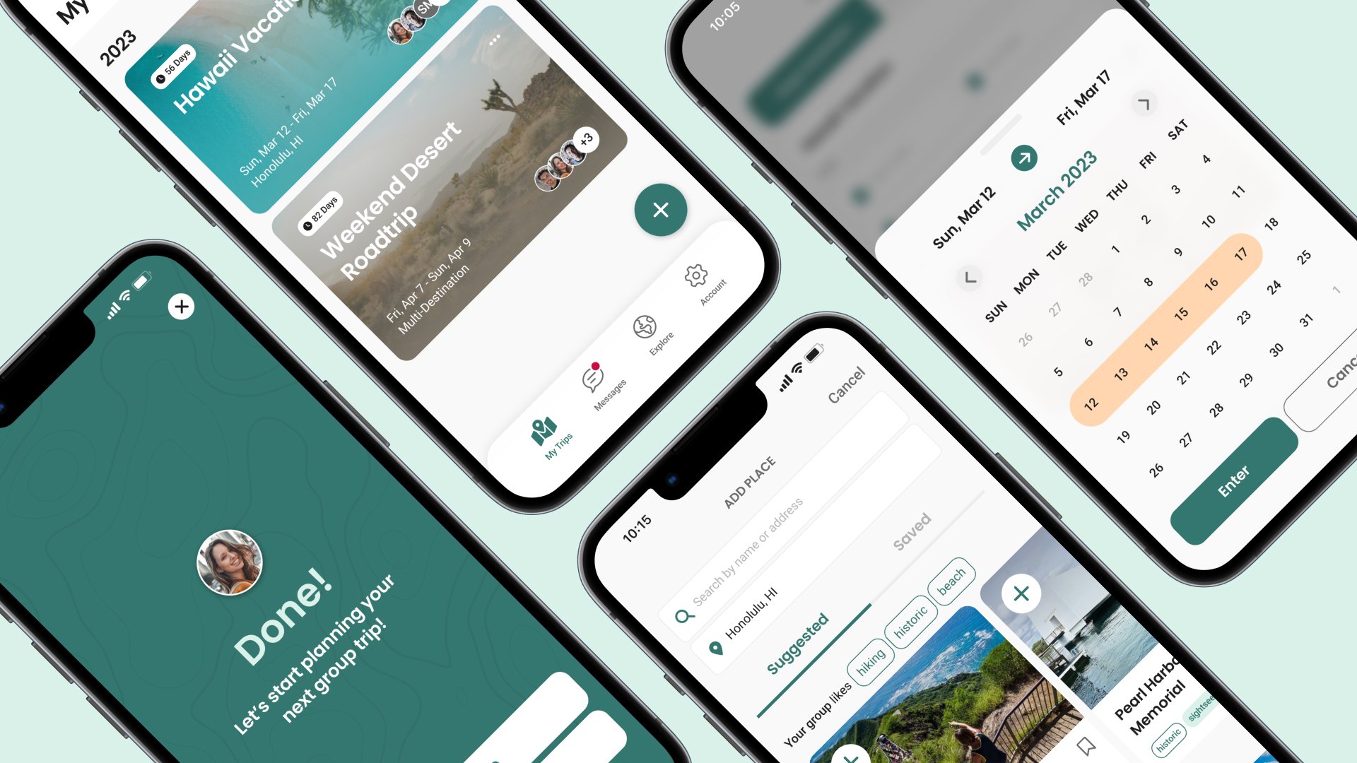
Hi-Fidelity Screens
Bringing Huddle to life on Figma.
With visual branding established, I applied color and typography to my wireframes to create the final screens in Figma. Emojis are paired with buttons to make the UI look more approachable, fun, and colorful. I used a topographical pattern as a design accent to represent adventure and add texture to sections of the app.

Huddle
[hud·dle] verb; noun: A small group of people or things that are close together; to come close together in a group; a meeting or conference.
Usability Test #2
Making small changes to starting and joining a trip.
I conducted a second usability test with users to validate changes made from the first test and to identify new issues.
While trying to start a trip, I observed that users did not notice the trip naming field and tried to enter their dates first. To fix this, I moved the naming field below the destination-type tabs, made the text larger/bolder, and added a focus state to the input with the keyboard open to encourage users to start typing. Doing so made naming a trip feel more natural.
A few users said they were concerned about privacy and weren't comfortable that anyone with the group code could join the trip without approval. As a solution, I added a join approval option when users start a trip and a notification after users enter a valid group code to join. That way, their request has to be approved before the trip appears on their dashboard.
The “Add to Trip” menu button text was also changed to “Quick Add” because some users thought it sounded too similar to “Add a Trip”. It also indicates a quicker way to add things to the trip.
A final test showed that users are able to execute these tasks without any issues or concerns.
Reflection
Final takeaways and learnings.
Huddle was a challenging endeavor. Despite making it more robust and accessible compared to Planr, there is still a lot of potential and features I didn't get to touch, like adding attachments, the explore tab, and more. However, I believe that I identified Planr's most glaring issues and came up with the best solutions. Similarly, by pulling in suggestions for places/activities based on common interests between users, Huddle creates more visibility for groups to plan more effectively where communication may be lacking.
During the UX process, I learned that user needs and habits can change unexpectedly and quickly. What I learned from users with Planr back in 2018 differed from what I discovered now, including how people travel and plan for it today. If I could have done something differently during this project, I would have conducted usability tests with users on competitor apps. Indeed, I took a lot of inspiration from Wanderlog and Tripsy, but I think validating through testing with other users would have yielded more insights that I could have applied to Huddle.