Case StudyUX Design · UI DEsign
Planr App
⚠️ Planr has been re-imaged into a new app called Huddle. View the full case study here!
Planr is a fictional mobile app designed to make group travel planning more efficient for users.
Overview
I wanted to design a way to make group travel planning easier and collaborative for users. With Planr, users are able to create a group trip, set a destination, add their friends, collaboratively add/vote on activities, and more.
Role
Final Course Project at General Assembly
Project Scope
User Experience: User Interviews, Research & Analysis, User Personas, User Flows, Information Architecture, Wireframing, Prototyping, Usability Testing, UI, Product Design
Tools
Sketch, InVision Studio

Problem Statement
People who travel with a group need an easier way to plan their trip together because everyone in the group has their own plans and interests.
Discovery & Insights
User Interviews
To better understand current trends and how users are planning for group trips, I conducted interviews with 5 people based on if:
They travel regularly
They travel with friends or groups
They are habitual planners
“They would ask me what we had planned even though I already told them months ago.”
Key Insights
Finding what steps these users took and what motivated them took some digging. Some of my key discoveries were:
Most users are the designated planner for their group and actually enjoy it.
Planning with friends in different time zones is a challenge.
Most users rely on conventional text messaging to plan and communicate with their group.
Analyze & Define
I looked at popular competitor apps to see what was already being done. Based on reviews and ratings on the App Store, I narrowed the top contenders to Tripit, Google Trips, and Kayak since they all include some form of planning and itinerary building features. Testing out the apps, I conducted some usability tests, taking note of any features that stood out or any issues I ran into using them.
Feature Comparison
All 3 competitors shared similar features you would expect from an itinerary or travel app. However, Kayak (Trip Huddle) had a collaborative voting feature that allowed users to vote on destination activities between people in their group.
Open Card Sorting
I looked back at my interview notes to categorize key ideas in an open card sort. All cards was sorted into groups labeled Features, Destination Planning, Competition, Drive/Motivation, and Roles. Prioritizing ideas and trimming down on “nice to have” features helped me formulate an MVP.
User Persona
Synthesizing information collected from the user interviews I conducted, I created a user persona for someone who would likely use Planr. Defining his goals, behaviors, and pain points helped me identify what users would want to accomplish using Planr.
User Flow
I mapped out a user flow illustrating how a user would complete the task to create a trip, invite friends, add/vote on activities, and generate an itinerary. Each step and action needed to be thought out carefully and include alternate decisions a user could make.

Ideate & Test
Wireframing
With a flow mapped out, I sketched out wireframes to map out how Planr’s UI would look and interact from screen to screen. I realized the number of steps required to create, select, vote, and save a trip meant wireframing more screens than I anticipated, but rapid sketching saved me time and flesh out quicker ideas.
Creating a Prototype
Using the wireframes, I designed low-fidelity prototype to build out the UI of each screen. Because so many interactive tasks were involved, there needed to be a clear indication on how to navigate each step. It took a few iterations to get to where I felt the task process was simple and not overwhelming.
Usability Testing
My screens ready, I put my lo-fi prototype in front of people I did/didn't interview, observing how they interacted with Planr when I tasked them with creating a trip. Most of my users found it generally easy to navigate, but noted the biggest confusion was locating the "create a trip" button.

Iteration & Results
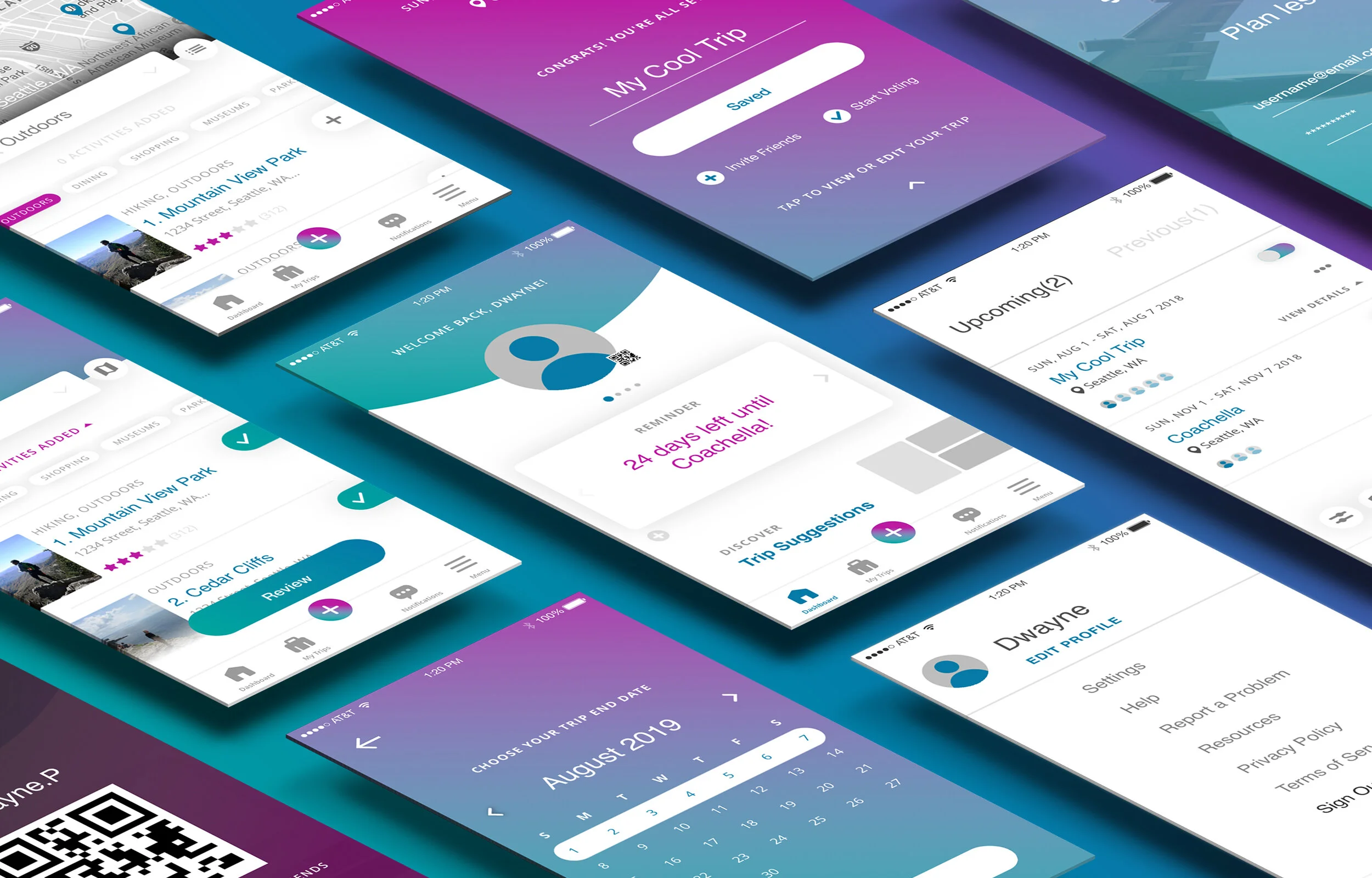
Final Prototype
With the user feedback in mind, I had to rethink the hierarchy of the dashboard because being able to create a trip was essential to using the app. After a few more iterations, I got more positive feedback on the issue. My final prototype included colors that made it easier for users locate buttons and make suggested actions to complete their tasks.
