Case StudyWeb Design · User Experience
Demmon Partners
Demmon Partners is a family-owned and operated real estate investment, management, and development firm in Northern California operating since 1960.
Overview
Demmon Partners wanted to update their website to share the story of the company. By giving context to their history, they were looking to attract new employees by emphasizing their employee-first vision and driving them to learn more about the business (and the people behind it). Additionally, they wanted to make it easy for current residents to access their resident portal and attract new residents by highlighting the perks of becoming a renter for one of their properties.
Client
Role
Web Designer for LeaseLabs by RealPage
Project Scope
Web Design, Responsive Design, Interaction Design, UI, Visual Design, User Experience: Wireframing, Information Architecture, User Personas
Tools
Sketch, InVision + Craft
Goals & Objectives
Speaking with the stakeholders of the company over a discovery call, we were able to define their business goals and align them with the goals of their target users: employees and residents.
Get prospective employees to learn about the company, the benefits, and how they give back to their community.
Get prospective residents to apply, learn about resident “Diamond Services” and current/upcoming properties.
Make it easy for current residents to access their resident portal.

Primary Demographic
Since the target groups were mainly prospective employees and residents, we were able to identify and create 2 user personas for both, identifying their goals and pain points:
Garret is a prospective resident who just recently moved to Sacramento for work and needs an apartment that’s close to his job where he can socialize and make friends.
Sarah is a prospective employee, and a wife with one child, working in corporate property management. She’s exploring different options in her career field and wants to work where she can give back to the community.

Mapping User Flows
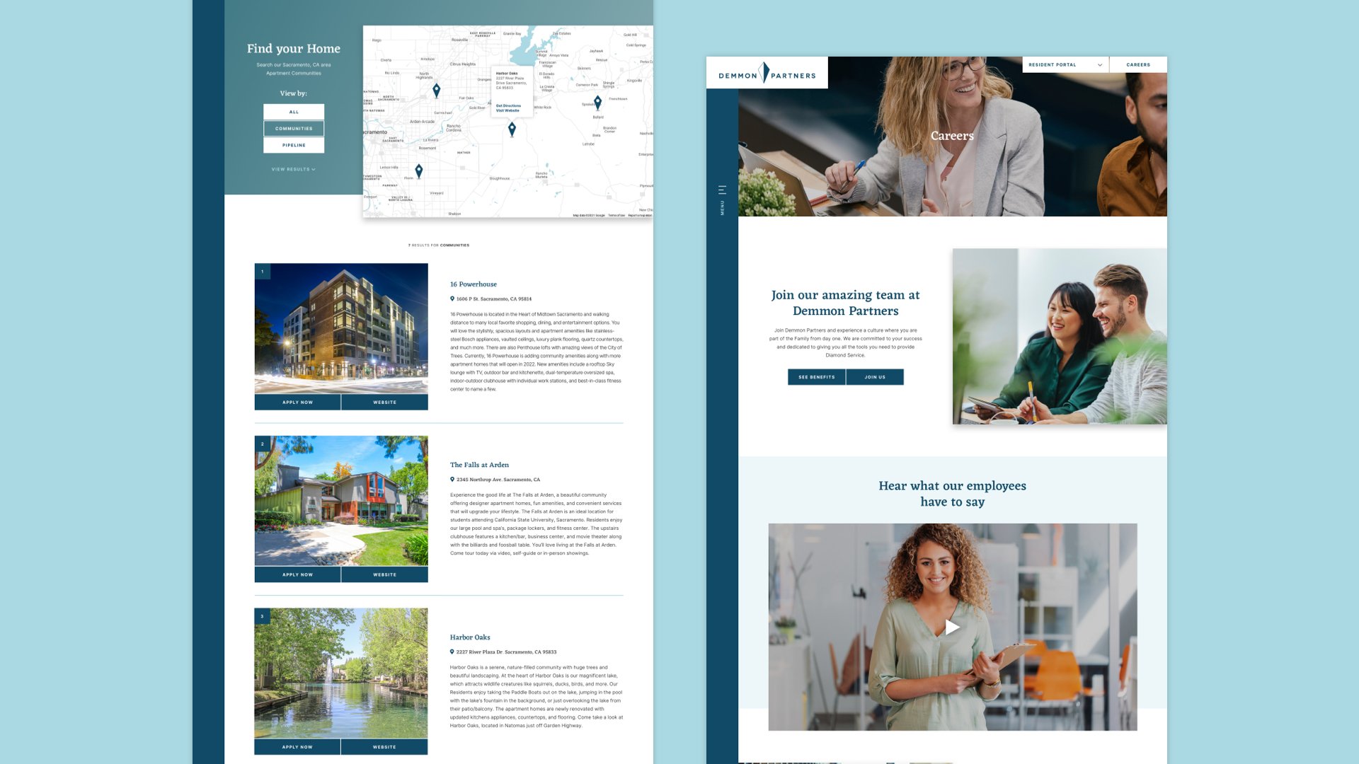
To better understand how users would accomplish their goals, I mapped out a user flow showing how they would complete their tasks once they access the website. I identified 5 different tasks users may want to complete based on their needs/wants of prospective renters and the goals of the business:
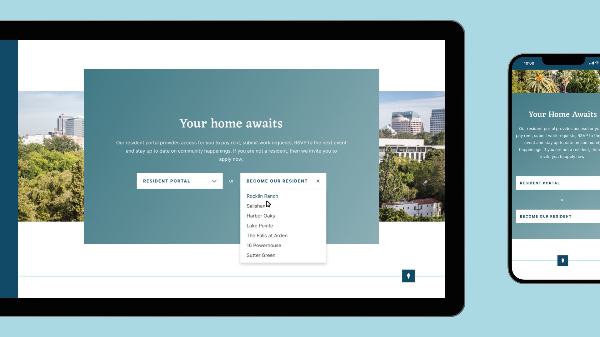
Current residents need to access their resident portal for a specific property.
Demmon Partners wants new residents to learn more about their properties, the perks, and apply.
New residents want to browse and apply for one of the properties.
Job searchers want to learn about working for Demmon Partners and apply.
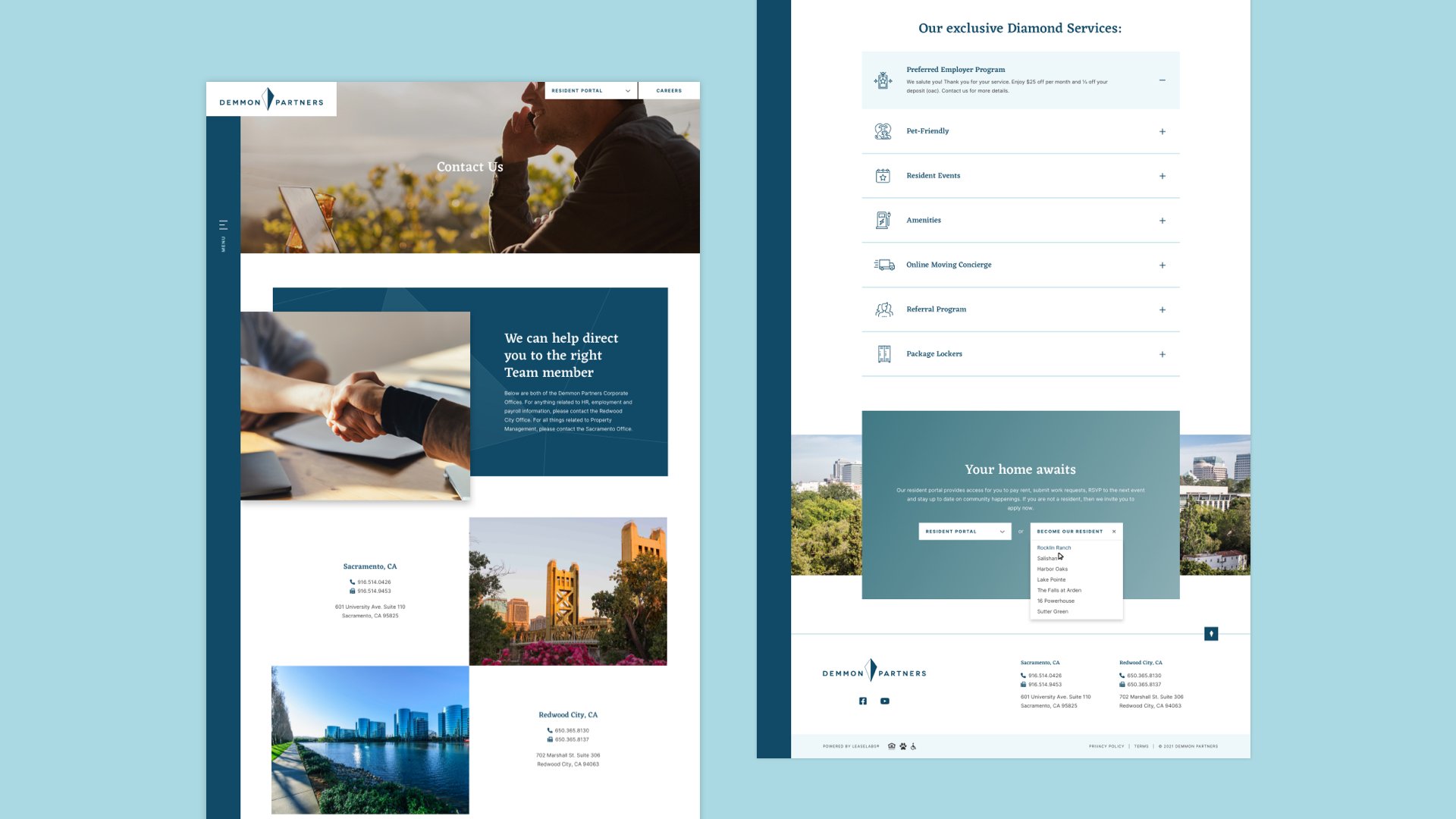
Users need to contact Demmon Partners with questions/issues etc.

Wireframes
Using my user flow diagram as a guide helped me frame my wireframes, starting from paper sketches to mid-fidelity mockups. The content provided by the client wasn’t lengthy, but it was important to lay them out strategically that would help users get to where they’re trying to go and access relevant information.
To tie the pages together, I structured sections to be modular so that they could be reused on different pages. Having familiar, repeated elements helped establish a visual flow for each page. Per the client's specific requests, I included things like an expandable side navigation bar, an interactive timeline, and a sliding carousel showcasing some of their employees.


Visual Branding
In addition to updating their website, Demmon Partners also asked us to create a new visual branding for their website which included new typefaces and colors.
I chose to use a sharp serif font for the headings that helped tell Demmon Partners history, and a modern san-serif font for body copy and supporting content to balance it out. I pulled blue hues for color to tie in with the diamond motif of their logo and their Diamond Perks and Awards.
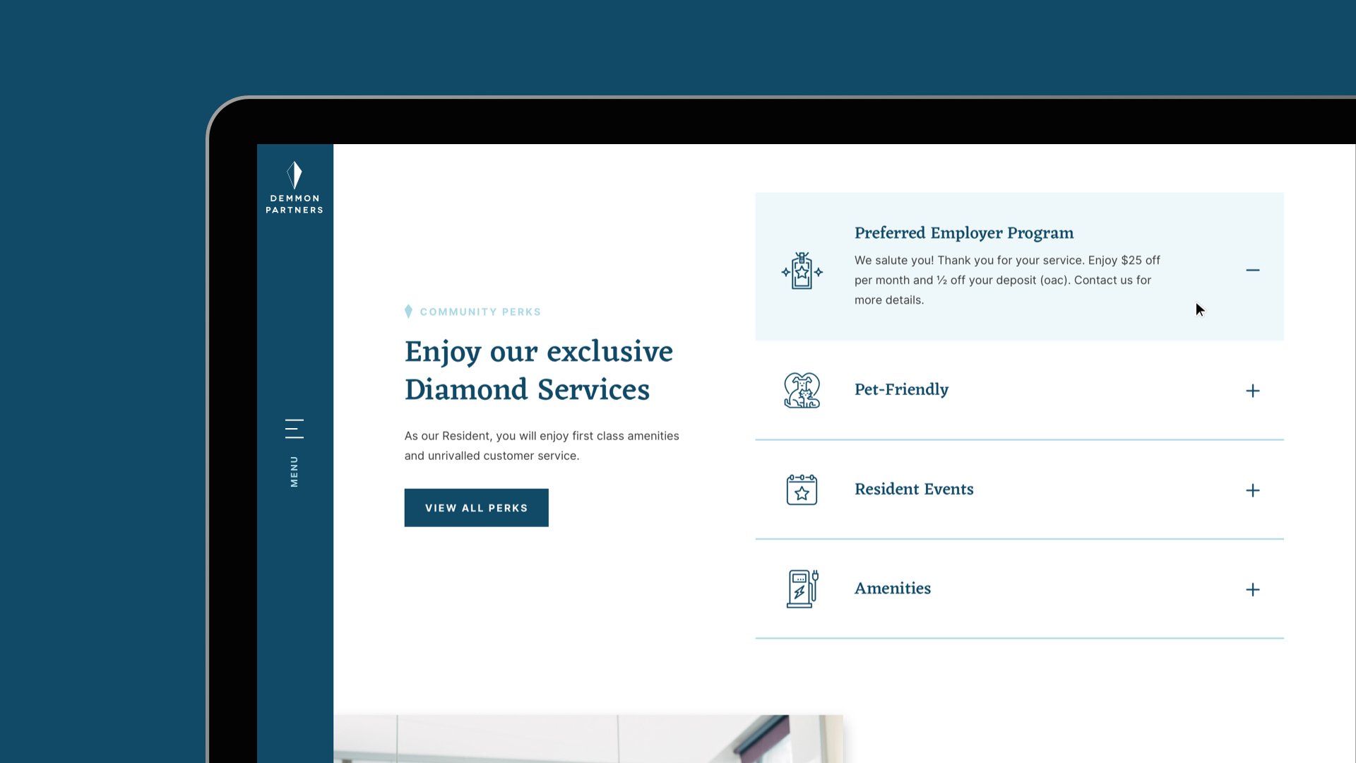
Supporting iconography also helped make content more approachable and helped visually illustrate resident perks.

Interactive Elements
To encourage users to explore more of the website, I designed for simple interactions like accordions, button hovers, dropdowns, and other action elements.
Because Demmon Partners is a smaller property management business with a smaller number of properties (>12) focused in the Sacremento area, having them filtered by tabs according to current and upcoming categories made more sense, instead of using a full search feature.

The client wanted a fixed, side navigation menu that would open like a hamburger tab. Having a full screen navigation menu allowed the space to house important information like phone numbers and office addresses that can be accessed at a simple click anywhere on the website.

To encourage prospective residents to learn more about resident “Diamond Services” perks, using an expandable accordion would allow users to see them all at a glance and discover more through a click-to-expand interaction.
The client wanted an interactive feature to their history section of their “About Us” page. I designed an interactive timeline that could have its different timepoints accessed via dots on the timeline or via arrows. Images would dynamically change as the user browses the timeline.

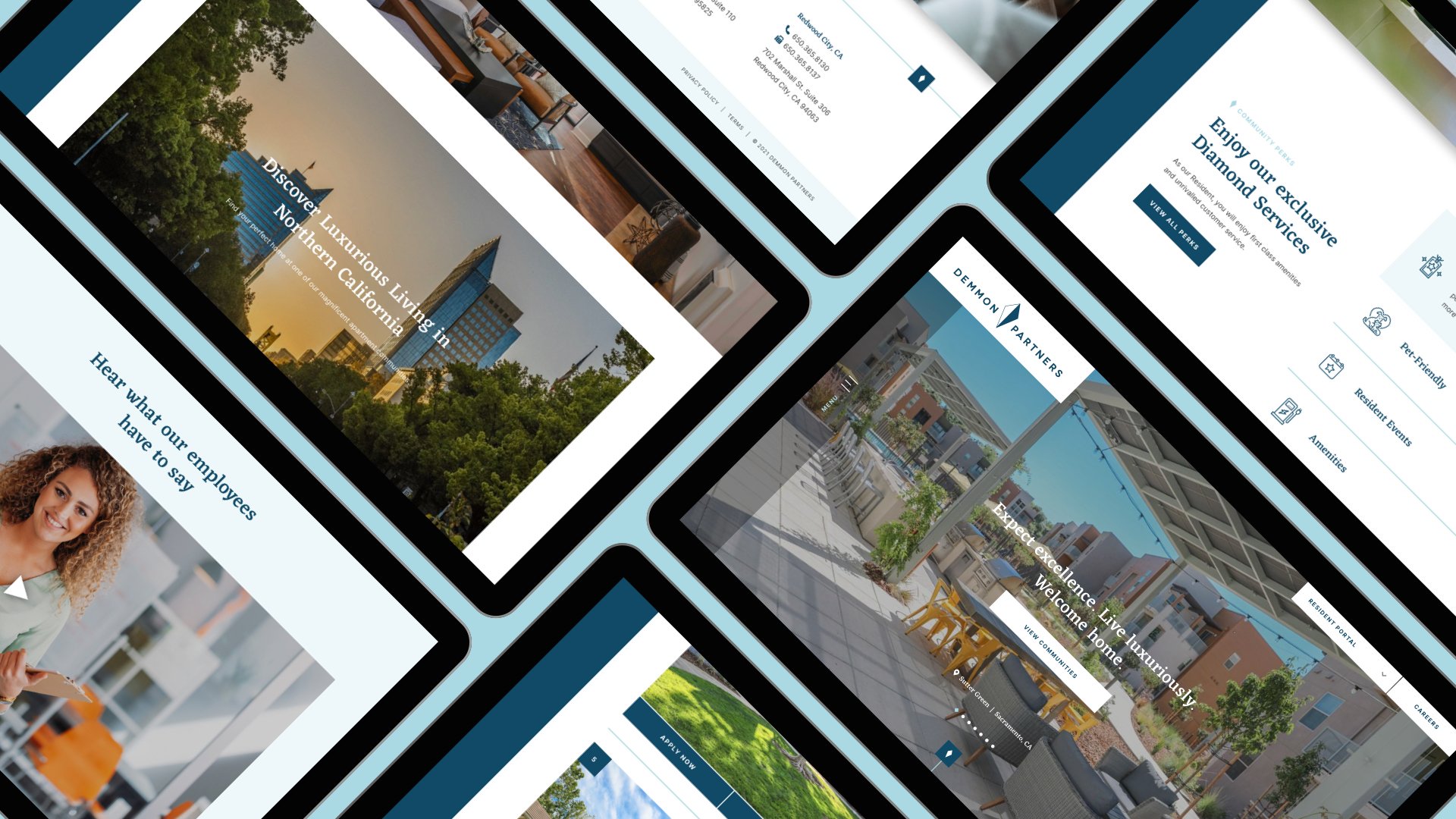
Designing for Mobile
Because the desktop website followed a modular structure without any complex, overlapping elements, the website was easily scalable on mobile devices without losing any integrity to the design. However, the properties map was removed due to recommended best practices for our mobile websites. Users could still browse the list of properties that are filtered by tabs.


Final Product
After reviewing with the development and project management team to have the website QA’ed and reviewed/approved by the client, we were finally able to deploy the website. The new, overall visual branding and experience for the website was a major upgrade from their previous website. Pages now had clearer hierarchy and purpose, and navigating around to accomplish tasks become more fluid for users.